Some thoughts on this weeks Apple Developer conference – WWDC 2020
Today sees the conclusion of the annual Apple Worldwide Developer Conference (aka WWDC 2020), and I just wanted to offer a few thoughts and highlights as to what’s been announced, what we can expect, and what it means to me and my clients.
First off it was a highly polished and professional keynote, as you would expect from Apple, but more so considering much of the events charm is in the atmosphere of a full auditorium of developers, something not possible this year for obvious reasons.

Apple Mac and the move to ARM
The big announcement, and worst kept secret, was that going forward new Apple Mac products (iMac, MacBook, Mac Pro etc) will be running Apple Silicone (ARM based processors – like the iPhone and iPad), a move away from the current Intel (x86 – like most Windows PC’s and Laptops use) chips. At a technical level this is massive for developers, but Apple have made as easy a pathway as possible, where it does become interesting though as this means there will be the ability for iPhone apps to run, out of the box on new Apple hardware. This means there will be a lot more apps available for the Mac instantly, but also a dilemma for developers and clients considering a Mac presence, to you optimise the Mac app as you have always done before, or make do with your iPhone app working on the Mac even if the experience is not idea?
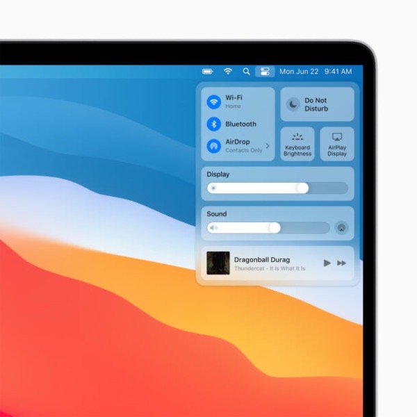
Mac OS Big Sur as it’s named got a visual overall too, looking very similar to the iPad it has to be said – time will tell on that one I think
iPhone and iPad
Even though technically iOS and iPad OS are separate things now, I’ll tag them together under the iOS 14 banner. I’m already running this in Beta, and so far it looks very pretty, stable, and a decent step forward, highlights include;
– Widgets on the home screens
– Upgraded Messages app (Pinned conversations, mentions etc)
– Offline translation
– App clips – Mini apps you don’t have to install / login and just use once, eg car parking apps
– Improved privacy notifications in Safari
– Scribbles – Handwriting recognition from the Apple Pencil to enter small amounts of text / search etc

Apple Watch
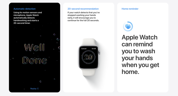
No real headline grabbers here, Watch OS 7 is just everything a little bigger and better than before, new workouts, watch faces, emoji (of course!), sleep tracking, and make sure you wash your hands properly!
Overall there’s a lot to work through, for many it’s, just an iterative year, for developers a little more exciting, but if you’d like to know more about Apple, WWDC 2020, or you are considering getting an App developed for any of the Apple platforms then I’d love to hear from you.
About me
Andy Flisher is a Mobile App Developer based in the North East of England with over 20 years software development experience. He is available for hire and specialises in cross platform mobile app development, web applications, desktop software, bespoke cloud architecture solutions and providing outsourced project management services.
Stockton’s Big Challenge Active Travel Portal – Case Study
Prior to Xyroh, Andy was the founder of dotUK (A software development firm based out of Yarm and Stockton on Tees here in the North East), again specialising as a developer in mobile apps, web applications and desktop software for a number of business clients – this is one of those portfolio case studies
Summary
Stockton’s Big Challenge is a web based community competition initially funded by Stockton on Tees Borough Council, NHS Stockton on Tees, the Big Lottery and Sustrans. The aim is to build awareness of Active travel and encourage a healthier lifestyle across Stockton by encouraging people to walk or cycle to work.
Technical
Client: Sustrans / Stockton Active Travel
Platforms: Web, Web Services,
Technologies: PHP, CSS, JQuery, Javascript, MySQL, Animation, Charting
Development: Web Development, Web Reporting, Jquery Animation
Case Study
Stockton’s Big Challenge was pitched as lottery funded concept aimed at encouraging local (Stockton on Tees Borough) Employees, and Employers alike to ditch the car and cycle or walk to work, in essence embrace ‘Active Travel’ and enjoy a fitter healthier lifestyle – all through the power of competitions
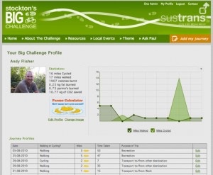

The competition premise was simple, each and every time you under took ‘Active Travel’ you logged in to the site, recorded the date, distance, time, and reason for travel. These journeys were then logged and your cumulative total displayed in terms of miles travelled, calories used, kg of fat burnt, kg of CO2 saved, and Parmo’s!
For those not local to Teesside the Parmo is a regional delicacy of note (http://en.wikipedia.org/w…) which through it’s ingredients of cheese, béchamel sauce, and being deep fried has a ridiculously high calorie count!
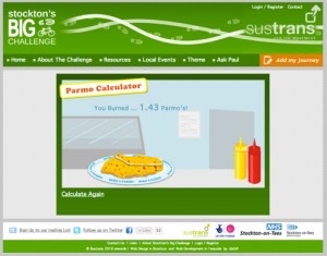
The Parmo Calculator was the welcomed challenge in the development as the concept was that we would allow site users to visualise their journey in terms of Parmo’s dropping to a plate, the shock factor being the tiny fraction of a Parmo that most journey’s equated to. We also made the calculator available as a stand alone tool that visitors could play with and drum up publicity. It worked, gaining the challenge and dotUK local coverage in local press, radio interviews, and even linked to and referenced by the Wikipedia article above.
The competition itself was broken down to allow businesses of different sizes to also compete by entering teams of employees (the cumulative score of their employees being totalled), as well as the individual completion. All user journeys, their ‘Parmo Counts’ and a dynamically generated report of miles walked / cycled over time was available in the individual users portfolios.
From an administration point of view, all aspect of the system were run form a secure web based control panel, this covers both user management, flagging ‘suspect’ journey logs, content management, and competition and winner management. The competitions were designed to be run time and time again between specific date ranges so we built tools that allow new competitions to be defined and journeys automatically entered between the relevant dates. Some winners prizes were also drawn at random so we created tools that allowed winners to be picker honestly.
When a competition is active the real-time statistics are published to both a widget on the home page and also to a dedicated live results page showing the scoreboard in terms of individuals and employers in the region. To further motivate year on year competition the historical archives of past competition results are permanently available and automatically generated.
Wrapped around the competition element of the site is the content management system. Near all content on the site it controlled through our own build web based content management system. Each page on the front end consists of one or more content blocks and the output content of those blocks is created by the administrator using the WYSIWG (What You See Is What You Get) editor.

This means that the administrator does not need to know, or have any real understanding of HTML or web scripting languages, they can simply type as if it were a regular word processor and format text style, colour, size and alignment with ease. In addition we created a web based media manager which allowed the simple upload of images to be embedded in the content thus allowing for the simple creation of visually rich, engaging content for their community.
Content wise these tools allowed them to manage 20+ pages of unique content instantly on demand, and engaging users beyond the competition. Content included local events, Bike maintenance tips, links to local resources and cycle path maps, the Sustrans Cycle network journey planner and much, much more.

